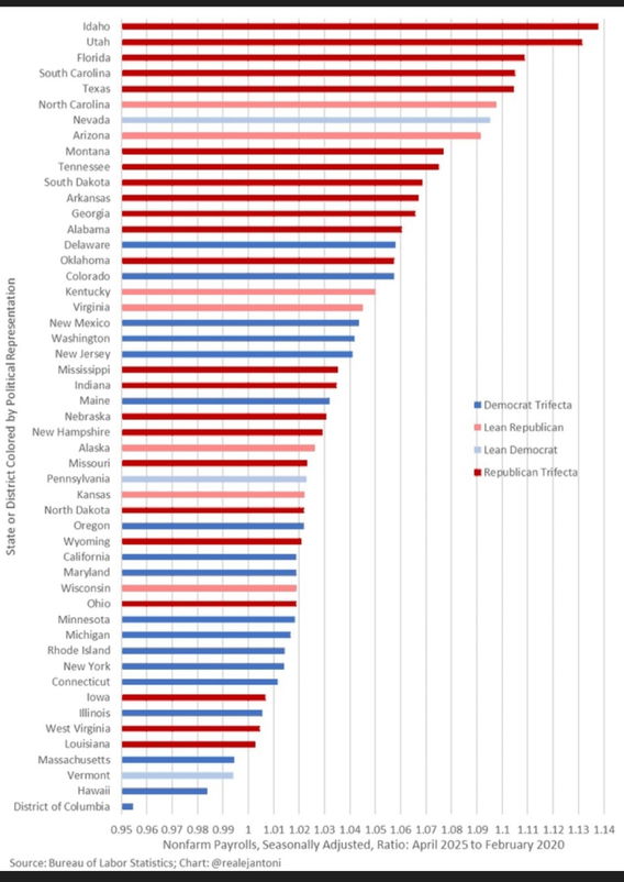
Graph shows job recovery in relation to pre-pandemic levels. The '1' at the bottom axis represents pre-pandemic job levels, '1.1' is 10% growth. The colors represent political party representation.
Graph shows job recovery in relation to pre-pandemic levels. The '1' at the bottom axis represents pre-pandemic job levels, '1.1' is 10% growth. The colors represent political party representation.
0 Комментарии
0 Поделились
2969 Просмотры